Case Study
PRODUCT DESIGN
Post-Alpha launch improvements
Improvements were made to the UX/UI of the new Assessment Tool (formerly Surveys), a new addition to the Ninety Business Operating System platform. The work focused on usability improvements in preparation for the Beta release of this feature.
Company
Ninety.io
Year
2023
Prototype of the UX/UI updates for taking an Assessment flow.
Project Background
Working in a growing and collaborative company, you don’t always get the design a project from the beginning. When I started at Ninety, one of my first assignments was taking over product design for the Assessment Tool which was just released to Alpha.
My Role
Refine the Assessment Tool and redesign some features to deliver a seamless, intuitive, and consistent user experience for the Beta release, ensuring alignment with usability best practices and user expectations.
My Team
I was the Product Designer and partnered with my POD team, which includes a Product Manager and three Engineers. Feedback and further collaboration with the Product Design Lead and team.
Understanding the Business Needs
Aligning to business needs is paramount in product design. I was guided by…
Problem Statement
“Keeping a pulse on your organization and those within it is vital when it comes to turning a good business into a great business. Without valuable insight and feedback from colleagues and stakeholders, it can be difficult to identify strengths and weaknesses, and target areas where action needs to be taken.”
Vision Statement
“Assessments will empower both individuals and businesses by harnessing insights and the collective wisdom of their audiences. By applying this actionable intelligence, Ninety will help inspire positive transformations and unlock hidden opportunities for thriving people and companies.
UX Goals
An easy, intuitive, and seamless experience for client leadership and team members to create, take, and view company Assessment results.
Experience that adds value and engages the user.
Business Goal
“Allow users of Ninety to start collecting data that they can use to make decisions that improve the businesses operations and culture. Bottom line to help your entire organization focus, align, and thrive.”
Design Process
Redesign and refine the Assessment Tool to deliver a seamless, intuitive, and consistent user experience for the Beta release, ensuring alignment with usability best practices and user expectations.
Step 1: Understanding the Tool and Context
Conducted a comprehensive demo of the Assessment Tool to understand its functionality and the journey to Alpha release.
Reviewed indirect competitors to identify industry standards and opportunities for differentiation.
Step 2: Heuristic Evaluation of the Alpha Experience
Conducted a heuristic evaluation to identify usability issues and areas for improvement.
Compiled an audit of the Alpha experience, categorizing updates based on effort and impact.
Collaborated with the Product Manager to prioritize updates and proposed a roadmap for enhancements.
Created Figma mocks to illustrate potential redesigns and improvements.
Step 3: Incorporating Feedback from Leadership and Alpha Testers
Reviewed feedback from the Senior Leadership Team and Alpha testers to evaluate key pain points.
Researched potential solutions to address feedback concerns while maintaining consistency and usability.
Delivered updated Figma mocks reflecting the proposed changes for alignment and approval.
Step 4: Updating Interactions and Layout for Beta
Refined interactions and layouts with a focus on creating a responsive, mobile-friendly experience.
Developed interactive prototypes and defined clear requirements for development handoff.
Provided detailed Figma screens with annotated interaction and layout specifications.
Step 5: QA and Final Adjustments
Conducted thorough QA of tool flows and functionality to ensure usability and alignment with design intent.
Documented bugs in Jira for resolution before the Beta release.
Validated the feasibility of user flows with back-end functionality to confirm technical alignment.
Outcomes
The iterative process ensured the Assessment Tool Beta release was user-friendly, visually consistent, and aligned with usability best practices. By incorporating stakeholder feedback and leveraging competitor insights, the redesign enhanced the overall experience and laid a solid foundation for future iterations. Some of the updates from the redesign included:
Card redesign
Design update for Desktop devices
Designed an 880px fixed-width card to work on smaller screen sizes.
Height will be variable.
Max height of the Header component to support 1 through 3 line questions.
The first answer always starts at the same horizontal position on the screen.
Design update for Mobile devices
Max card with is 340px, fixed the content introducing horizontal scroll.
Added elevation on the footer.
UX/UI Updates
Refreshed buttons with newer design system components.
Made footer with progress bar sticky.
Added branded graphic to replace icon on the confirmation screen.
Added save and close CTA.
Added Toast notification for exiting a survey.
Added confirmation pop-ups when ending the assessment early.
Added Reopen Survey functionality.
Bug fixes
Some highlights from the artifacts delivered…
Heuristic Evaluation
Following the framework recommended by the NN/g, three main task flows in the Alpha release of the Assessments Tool were evaluated to determine some areas of improvement to implement prior to the Beta release. Numbered lists within each section highlight the areas for improvement.
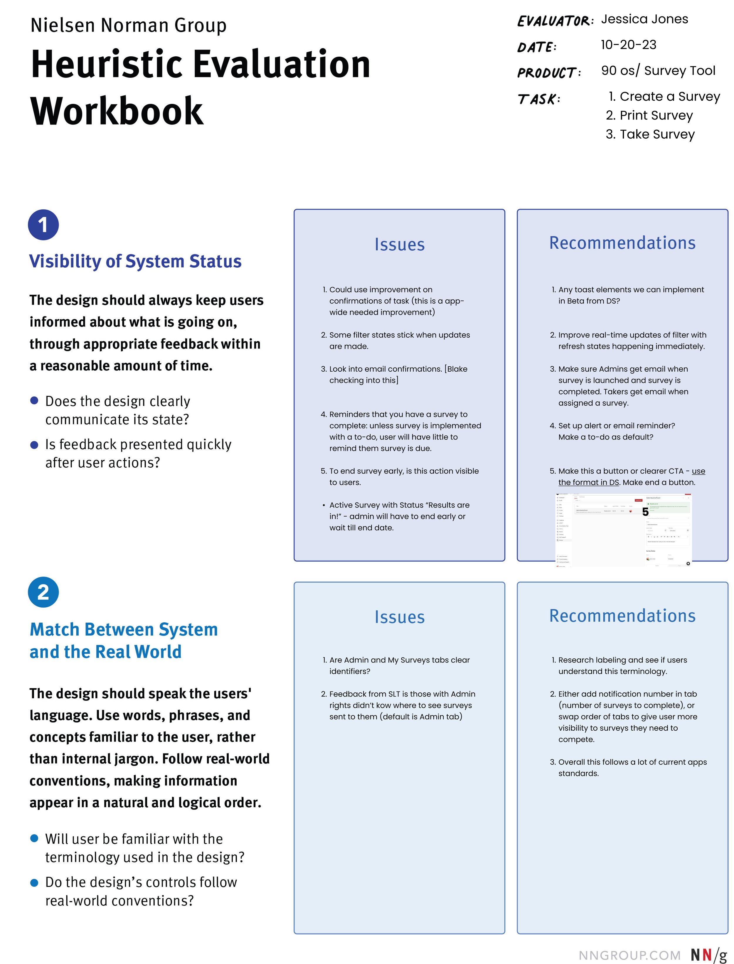
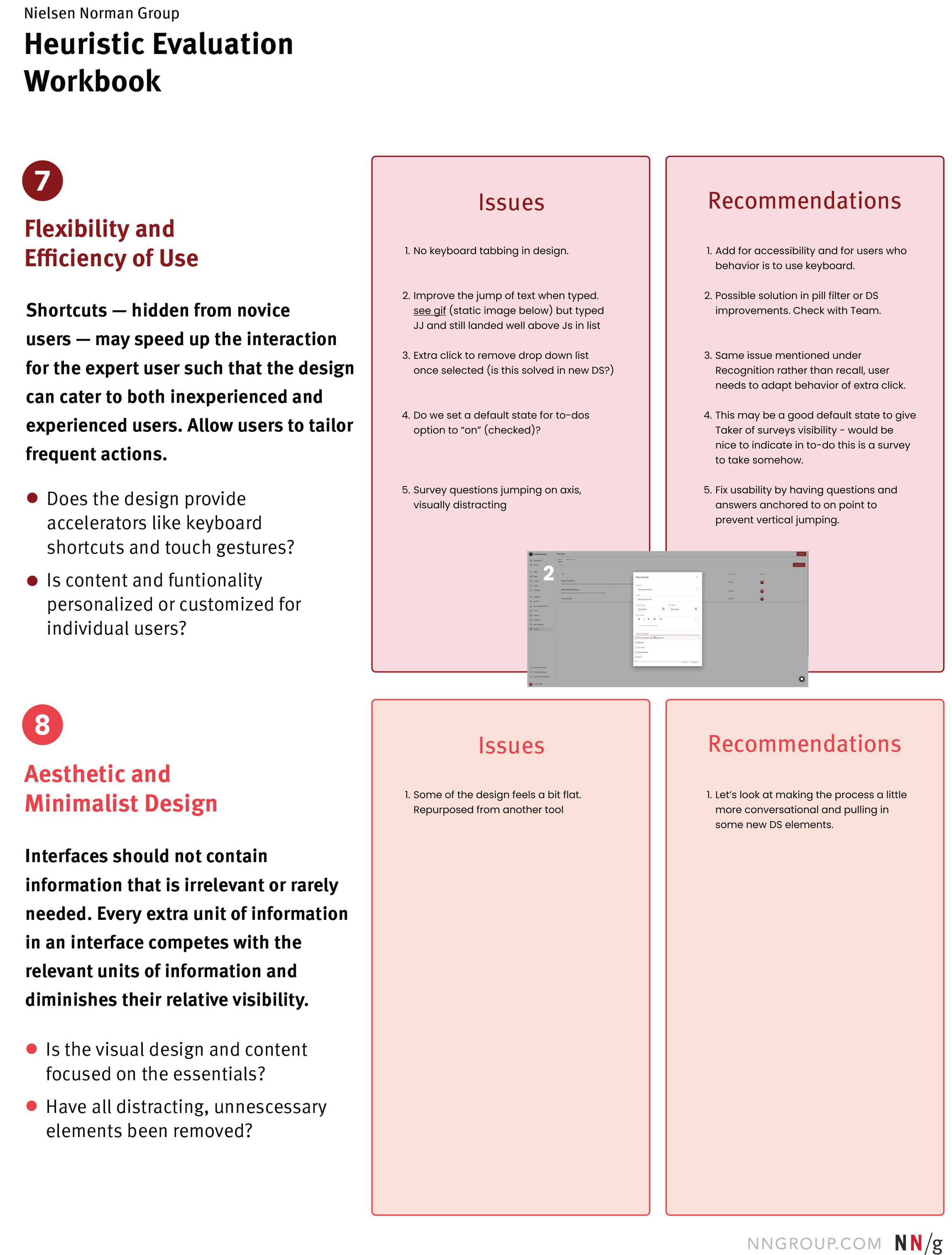


Improvements were identified and categorized based on effort and priority.

Revised UX/UI for Taking an Assessment flow (before and after)
Desktop
Before (Alpha Screens): Assessments Cards desktop view.
After (Beta Screens): Assessments Cards desktop view.
Tablet
Before (Alpha Screens): Assessments Cards tablet view.
After (Beta Screens): Assessments Cards tablet view.
Mobile
Before (Alpha Screens): Assessments Cards mobile view.
After (Beta Screens): Assessments Cards mobile view.
Branded design for completion screen (before and after)
Desktop
Before (Alpha Screens): Completion screen desktop view.
After (Beta Screens): Completion screen desktop view.
Deliverable to development: Figma screens with annotated interaction and layout specifications.

Redesigned Assessment cards with specs to work responsively.
Card Specs
The max width for the card is 880px, with a variable height based on the content.
Since the max width is 880px in desktop views, at about ~960 px the card should resize to 720px for tablet.
Mobile views should resize to fill the screen without the blue highlight element at the top of the card.
Card contents
The title field will be centered vertically in a space with a max of 120px.
The first question on the card starts on the same x coordinate for all cards.
Footer
Always anchored to the bottom of the screen.
Always viewable on screen.
What I learned.
This first foray into Product Design was a great project to get me up to speed on the Assessment tool, its requirements, and the business and vision statements. It also gave me a chance to make immediate UX/UI improvements to the tool via heuristics and feedback.
The story continues…
In an iterative world, see additional case study for Post-GA user guidance improvements for the continued evolution of this tool and the user experience in the Ninety platform.
Tools Used
Figma, Jira, Google spreadsheets.